
A couple of times this year I’ve grabbed tee shirts from the Don and Joe/Frank discard pile for some silk-screening experiments.
Because I am insane, I needed to repeatedly remind myself I was not aiming for perfection and to just get onto it. The goal was to rebuild creative confidence (where did it go?), stop getting in my own way and get out of my head. And now a bonus challenge of posting items where I can see every flaw!
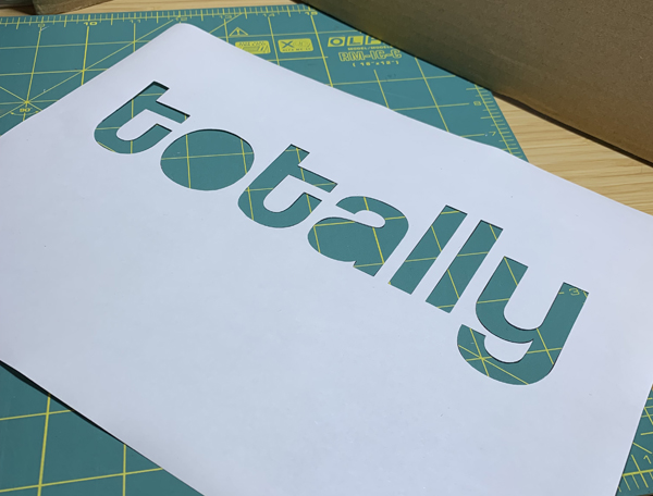
This is a somewhat photo heavy post to illustrate (and remind myself!) how straightforward** the process is. “Design” in MS Word, print on A4 printer paper, cut out design with scalpel, line up under screen and squeegee away!
The absolutely most challenging part of this for me is lining everything up correctly. This is where washi tape came in very handy. Washi tape is handy for a lot of things – you should totally buy some.
I’m lucky to still have a steady hand for cutting, but I’m not sure I could repeat the magnificence of Joan’s 2009 Stanford step-daughter shirt.
It’s been fun to play around. I will do more I think. The shirts have been perfect for messy crafting classes and other similar activities – and they get a bit of love.
♥
My first effort was inspired by a cheap t-shirt I briefly owned and had to discard because it was hideously synthetically uncomfortable.
I thought about this for ages and finally just got on with it back in April.
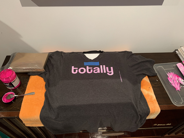
This is the first time I’ve mixed white and a colour. This is because colour alone wouldn’t have been very visible on the dark fabric. I wanted to use supplies I had so it was a bit of an experiment. The mottled effect is intentional (more experimenting!). I like it!
Font is: coolvetica (free)
Printed in April
Things for next time: mind the gap between the stencil and frame!


action shot!
♥
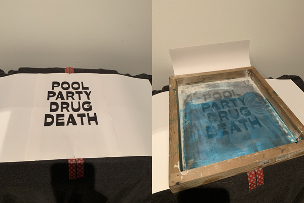
As soon as I saw this artwork, I knew I had to do something with that phrase.
I had this up on the wall in the not-craft room for a while in Arial Bold, but didn’t love it. I finally randomly came across a font I thought would be perfect (I think from the Dense Discovery newsletter), so I dithered for an age and then paid for it.
Font is: Sweller sharp (scroll down to #06)
The kerning on “party” in standard word drove me crazy (looking back, it’s awful on the original artwork too). In the end I had to resort to word art and line up the individual letters in a more pleasing way (this is good to know for the future).
Printed in October

♥
And my final of the set. I was really pleased that I could “design”, print, cut and screen within a couple of hours. This ease and lack of overthinking is exactly what I was aiming for!
Font is: akira expanded (free)
Printed in October


hiking action shot!
♥
Next I think something more complex. I am utterly in love with she was a reader of detective novels (somewhat less so the actual art). I might give it a crack. Though it’s a lot of words to fit on a shirt.
♥
** I acknowledge that most people probably don’t have these supplies just kicking around their houses. I sometimes forget this!