I follow quite a lot of design blogs because, well, I’m a wanker.
Sometimes these blogs have words along with the pretty pictures. These words are not entirely dissimilar to dreadful, turgid artist’s statements – but generally much, much worse.
This morning I encountered quite the best narrative I’ve seen for a while. From design milk:
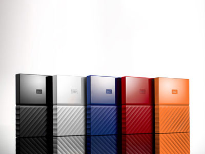
“The core of fuseproject’s design refresh resonates with the element of tension: a dichotomy between users’ increasingly public online lives versus a securely private one. This dichotomy is manifested in a bisected rectangular block drive divided into thematic halves: a angled and textured foundation below, with a clean surface top. The Lifeline, as fuseprojects and Western Digital call this metaphorical dividing center, operates to symbolize where the social and private meet.”
Yep, you know that’s exactly what went through my mind when I first saw these external hard drives:

Absolutely dripping with manifested dichotomic tension.

shudders